

Making tracking data more fun and engaging
Basically my love letter to football analytics and a personal rant about how football stats can be a lot more fun and engaging through in-game graphics.

As a football fan, it is hard to escape the term ‘xG’ or Expected Goals in the past few years. It is everywhere, and I mean everywhere. From articles written by your favourite football/soccer writers, to plenty of posts all over social media, to some of the most popular football apps, and even onto live broadcast of matches in the past couple of years. While xG is becoming a household stat for most fans (despite plenty of hatred that the stat still gets), for football analytics fanaticos and data otakus, most people will know that xG is not really a new metric in the industry.
It is hard to trace back who actually invented xG because the concept of recording the probability of scoring a goal goes a long way back in football history, like way back in the 70s and 80s. There has been various papers since the 90s that have examined and refined the idea by adding more details to such probability in an attempt to add more context to a shot or a goal. But the earliest form of the xG that most people now know and love/hate was popularised by a legend of the industry, Sarah Rudd (formerly Arsenal’s head of analytics), and Opta’s Sam Green. Sarah’s presentation was later built upon by now-Arsenal’s data scientist Karun Singh to become xT (or Expected Threat), while Opta continued to build on Sam’s blog post and became one of the early adopters of the xG that we now know.
There is a reason for all of this talk about xG because it is always important to look back at the past in order to move towards the future. To quote Sébastien Coustou, formerly Parma Calcio’s Head of Football & Analytics,
We really stand on the shoulders of giants.
While xG is probably old enough that the young generations can call it ‘unc’, the future of football analytics is already here. Before talking about exo-skeleton data that various sports (like cricket, tennis, and basketball) are already adopting, tracking data is slowly taking up a more important role not just in the industry, but also for football professionals like players, coaching staff, sports scientists, etc. With xG now entering the mainstream, what lessons can we learn from the usage of xG in media that we can use for tracking data to make it more fun and engaging for everyone?
Data storytelling is an art
Conveying the meaning of a number is always a hard task. It is not only about finding the right context and information to build around that number and turn it from a single number into a full picture, but it is also about delivering the right message to the target audience and help them understand what is happening in the picture. The harder part about that is, there are different audiences with different level of understanding and different needs and intentions.
For the casual football fans, they want quick, easy-to-understand information that can be used to start conversations over a pint or two of beer (or to quickly make a post on social media for engagements, ughh). For the knowledgeable fans, they want a bit more details and in-depth metrics to help them understand why their favourite team(s) are playing well/bad, or to get a better understanding of the players that their club are signing and what they can bring to the team. For football professionals, they want a lot of information and metrics to improve their performance both on- and off-the-pitch, and both on an individual and team level.
The question here becomes, how can data practitioners and data storytellers find the right level of detail to tell a meaningful story? It is impossible to satisfy the needs of everyone, so finding the common ground for everyone is very, very important for a story or a metric to reach a wide audience. xG was able to breakthrough into mainstream because, on the surface, it is a relatively easy metric to understand. Basically, it measures a shot’s possibility of becoming a goal, that’s it. The lower the xG is, the lower the probability of a shot can turn into a goal, and vice versa. But xG is also hated by many because there are a lot of nuances to it, and even some levels of subjectivity, hence the need to create post-shot xG (or xG on target, xGOT in short) to add more context for xG.
Going back to tracking data, it would be a misunderstanding of its potential if tracking data is only used to calculate aggregated stats like xG. Obviously, there are some useful aggregated metrics that can only be calculated using tracking data and can still provide useful insights. But the reason why tracking data exists is to provide a lot more context that event data or aggregated data cannot, and to once again take that context away and restrict tracking data into just a single number is somewhat not getting the most out of it. That is where the second part of data storytelling comes in handy, visualisations.
Moving beyond 2D visualisations
By now, there have been countless football visualisations made by so many football analytics professionals and enthusiasts across different social media platforms, including yours truly on this very blog. From xG timelines, match momentum, pass networks, to player radars, pizza charts, percentile bars, football data have come a very long way.
But the one common theme among those visualisations that I just listed is that they are all plotted on a 2D canvas. They are still useful, no doubt about that, especially for player performance data and aggregated metrics. For tracking data, however, visualising such data on a 2D pitch does not really tell the full story. Sure, it can definitely look like the old days of Football Manager’s 2D view or the player radar view on PES/eFootball or FIFA/EAFC, but there is a reason why those football games still have and show a 3D view of the game. So, why not do that for actual live matches?


There have been attempts at showing a live match along with a player radar like on PES/FIFA, but that has not caught on at all, so I won’t be talking about that. Instead, I want to shift the attention towards what La Liga have been doing this past couple of seasons by using on-screen visualisations with animations to quickly show data and highlight interesting things during the game. The title image and this image below are just two examples of La Liga’s in-game graphics. A few tabloids have said it looks straight out of a video game, which it kinda is, but I think it is a good demonstration of how far tracking data and telestrations have gone in the world of football.

If the NBA on ESPN, Fox Cricket, and Australian Open with HawkEye have these 3D/in-game visualisations, why can’t football have them as well? It is definitely slightly harder in football since there are less downtime for any visualisations to quickly show up, but La Liga have pioneered such technology and have shown that it is possible to show in-game visualisations without significantly affecting the experience of watching a live football match. This is the reason why I wanted to use Sébastien’s quote earlier, football analytics where it is now is standing on the shoulders of giants because these ideas are not new and have already been implemented elsewhere. Nothing is impossible, it is just the matter of when and how those ideas will be re-implemented, but for football.


Originally, I had a bit more plans for this article where I come up with ideas and vizzes that can be introduced onto live broadcasts (albeit in somewhat of a different form) and attempt to use tracking data from Skillcorner to create some new visualisations that I think can be engaging to both the commentators and the fans. Here’s a sneak peak of what I was able to come up with (first in 2D, then mimic 3D through still images).
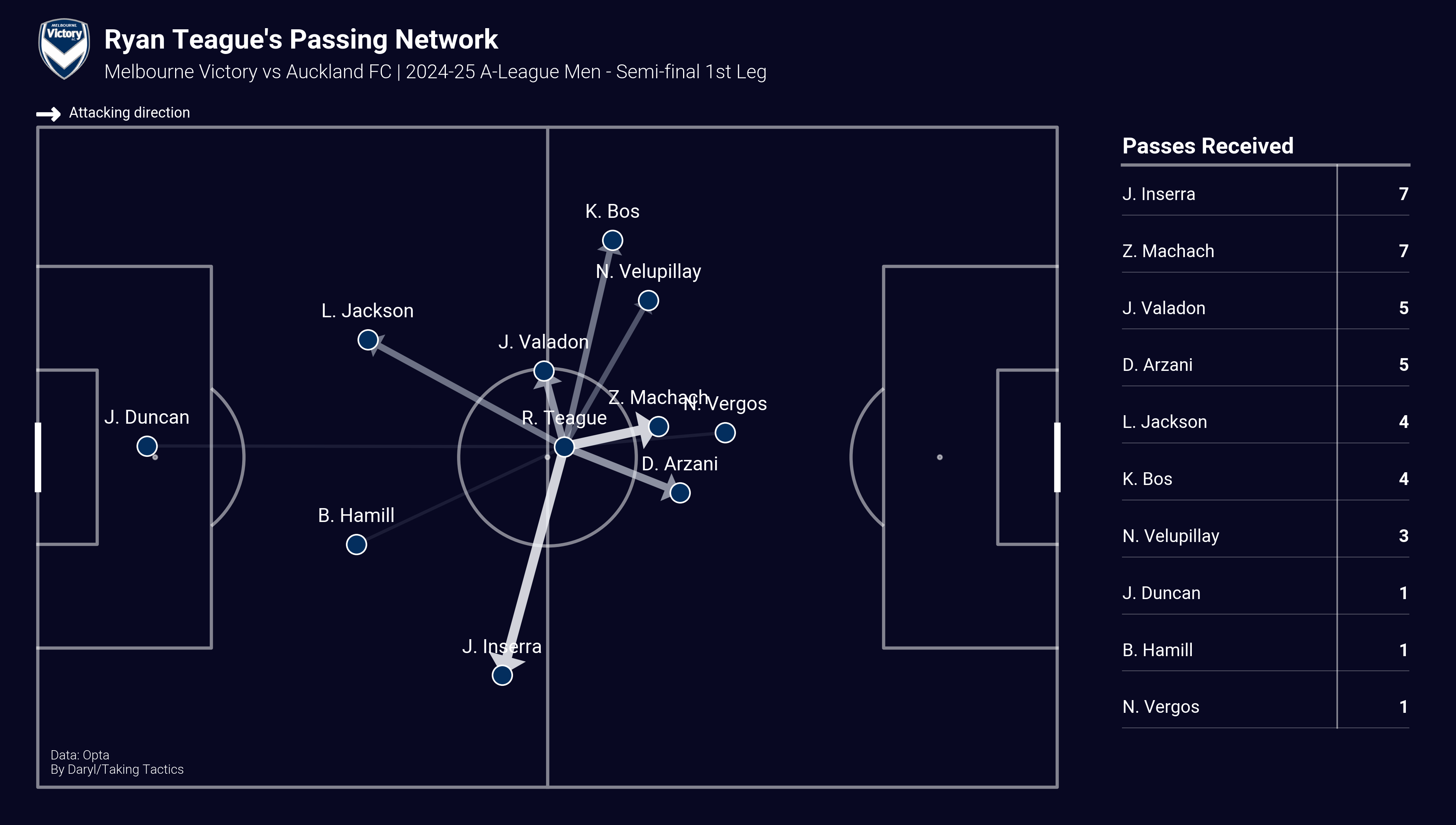
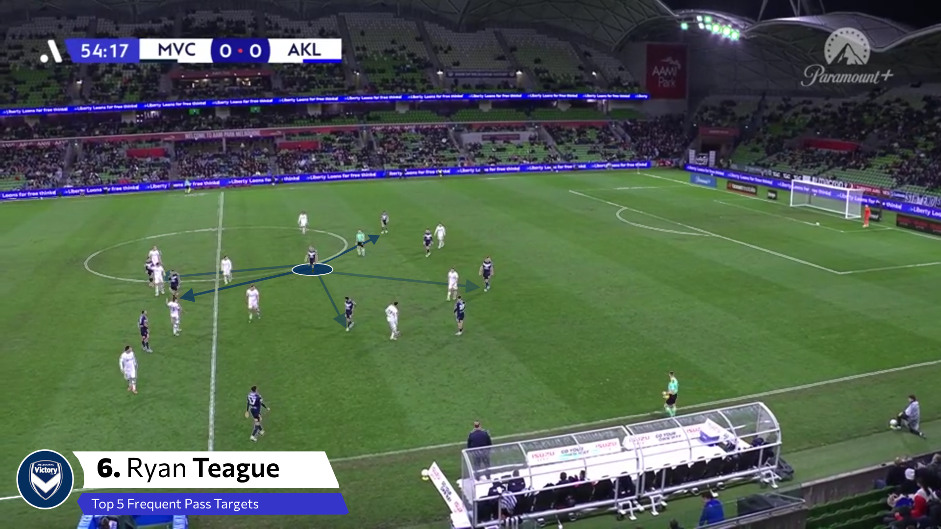
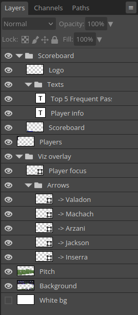
But a surprise cold came down, which did not help me make as much progress as I wanted to during the weekend. It also allowed me to take a step back and realised that this might take a lot more effort than I originally thought, especially without any telestration tools and me having to edit the still images manually via GIMP and Photopea.
As such, I want to leave this article here and maybe come back later when I feel a bit better and have more time to spend on making telestrations. But hopefully this article will inspire someone to look deeper into making 3D visualisations and create new and useful vizzes!